Config Specification
Overview
This documentation outlines a generic schema for defining UI components within an admin panel. It serves as a guideline for adding or modifying components, ensuring a consistent approach to configuration across different types of elements within the application.
Common Properties
componentName
- Type: string
- Mandatory: Yes
- Description: The human-readable name of the component, intended for display label in the form.
componentType
- Type: colorpicker | numberInput | selectInput | textInput | multiSelect | molecule
- Mandatory: Yes
- Description: Specifies the type of the component, determining its functionality and rendering method. Examples include
colorpicker,component,textInput,fileInput.
defaultValue
- Type: string | object
- Mandatory: No
- Description: The default value of the component. The type and format can vary based on the componentType.
isAvailable
- Type: boolean
- Mandatory: Yes
- Description: Determines if the component is available for use within the application.
showInAdmin
- Type: boolean
- Mandatory: Yes
- Description: Controls whether the component should be visible and editable through the admin interface.
category
- Type: theme | molecule
- Mandatory: Yes
- Description: Categorizes the config based on their nature.
Where ,
themeis used for style related configuration andmoleculeis used for UI molecule(component).
props
- Type: object
- Mandatory: No
- Description: Contains additional properties specific to the component.
keyName: A unique identifier for the component, used in code.children: An optional array of child components, each following the same schema.
Optional Properties for Child Components
children
- Type: array of objects
- Description: All the nested components can be added through it.
Example Config
[
  {
    "componentName": "Primary Color",
    "componentType": "colorpicker",
    "defaultValue": "#ffffff",
    "isAvailable": true,
    "showInAdmin": true,
    "category": "theme",
    "props": {
      "keyName": "primaryColor",
      "children": []
    }
  },
  {
    "componentName": "Navbar",
    "componentType": "molecule",
    "defaultValue": "",
    "isAvailable": true,
    "showInAdmin": true,
    "category": "molecule",
    "props": {
      "keyName": "navbar",
      "children": [
        {
          "componentType": "textInput",
          "componentName": "Brand Name",
          "keyName": "brandName",
          "defaultValue": "brandName",
          "isAvailable": true,
          "showInAdmin": true
        },
        {
          "componentType": "fileInput",
          "componentName": "Right Side Logo",
          "keyName": "rightLogo",
          "defaultValue": "",
          "isAvailable": true,
          "showInAdmin": true
        }
      ]
    }
  }
]
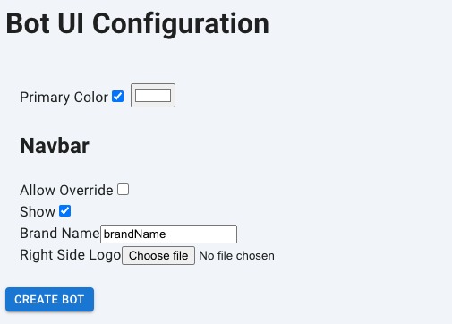
Render Config
The above config will result in rendering the below form in the admin panel.
Output JSON
Based on the filled values the result config will look like this,
{
  "theme": {
    "primaryColor": {
      "value": "#11e477"
    }
  },
  "molecule": {
    "navbar": {
      "brandName": "test bot"
    }
  }
}