Home Page
The HomePage component is a React page designed to serve as the main interface for users to interact with the application. It allows users to input messages or questions, view relevant buttons for actions, and optionally display a voice recorder.
Usage
import HomePage from './HomePage';

const App = () => {
  return <HomePage />;
};

export default App;
Description
The HomePage component consists of the following elements:
- It provides an input field for users to enter messages or questions.
- It may display buttons for various actions related to farming.
- Optionally, it can include a voice recorder for users to record audio messages.
Functionality
1. Input Message Handling
Users can type messages or questions into the input field. The input field adjusts its height dynamically based on the content.
const handleInputChange = (e: any) => {
  const inputValue = e.target.value;
  setInputMsg(inputValue);

  // Adjust textarea height dynamically based on content
  if (inputRef.current) {
    inputRef.current.style.height = 'auto';
    inputRef.current.style.height = `${inputRef.current.scrollHeight}px`;
  }
};
2. Sending Messages Users can send messages by clicking the send button. Empty messages trigger an error toast, while non-empty messages result in a success toast.
const sendMessage = useCallback(async (msg: string) => {
  if (msg.length === 0) {
    toast.error('Please enter a message to send');
    return;
  }
  toast.success('Message sent!');
  setInputMsg('');
}, []);
Dependencies
- React: JavaScript library for building user interfaces.
- Material-UI (Mui): React components for faster and easier web development.
Styling
- CSS modules are utilized for styling the component.
- Styles are defined in the index.module.css file.
Customization
The Home Page component offers flexibility for customization to match your application's requirements. Here are some customization options:
Theme Customization
Modify the colors and styles in the config.json file to match your application's design.
"theme": {
    "primaryColor": {
            "value": "#1e6231"
    }
}
Component Configuration
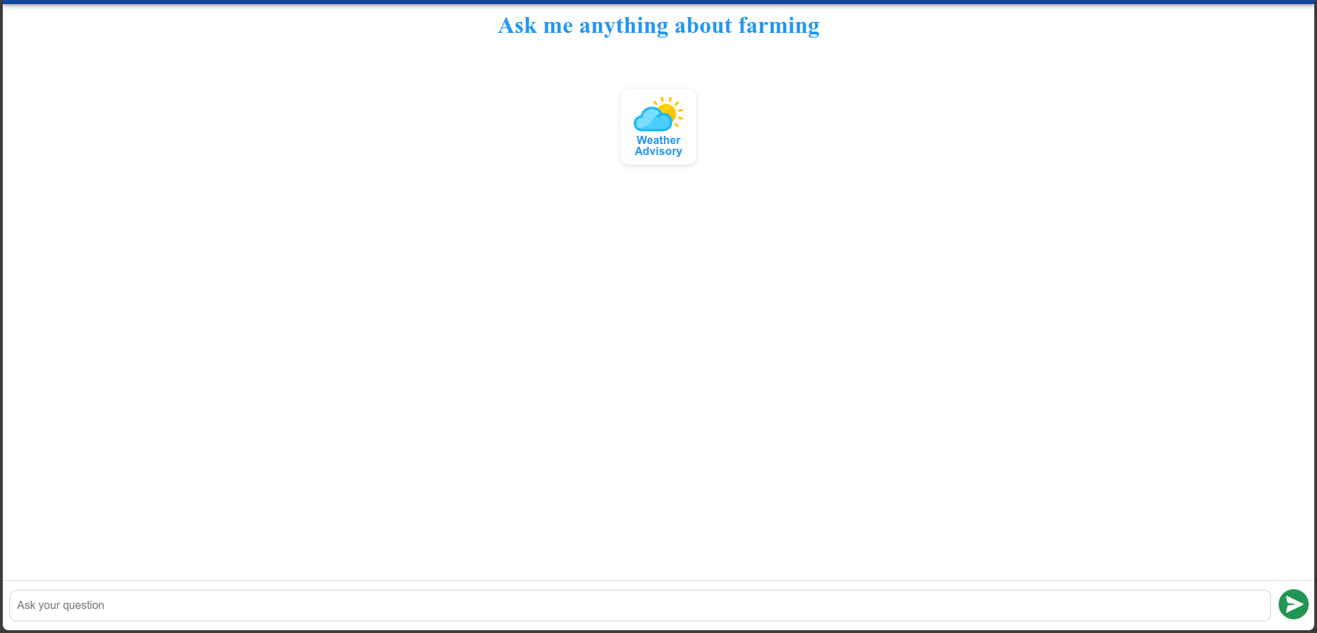
Update the component object in the config.json file to customize various aspects of the HomePage component, such as the title, button visibility, microphone visibility, and placeholder text for the input field.
"component": {
     "showKalia": false,
     "showWeatherAdvisory": true,
     "showPlantProtection": true,
     "weatherAdvisoryImg": "",
     "plantProtectionImg": "",
     "kaliaStatusImg": "",
     "showMic": true,
     "topGap": "120px",
     "micWidth": "143px",
     "micHeight": "143px",
     "showTapToSpeakText": false

}
Notes
- For further customization, you can modify the JSX structure, styles, and functionality according to your application's needs.