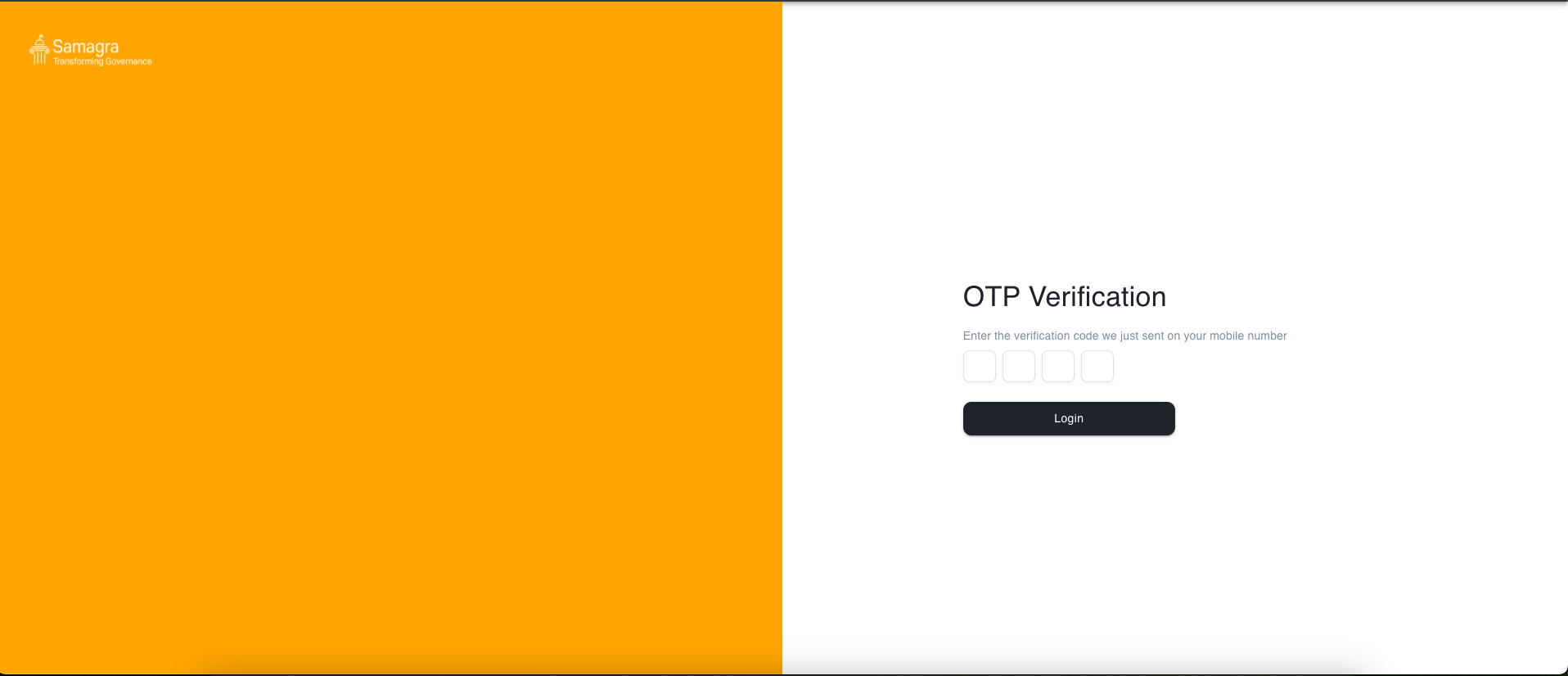
OTP Page
The OtpPage is a React component designed for OTP (One-Time Password) verification. It allows users to enter the OTP sent to their mobile number for authentication purposes.
Usage
import OtpPage from './OtpPage';

const App = () => {
  return <OtpPage />;
};

export default App;
Description
The OtpPage consists of the following elements:
- Input field for entering the OTP.
- Button to submit the OTP for verification.
- Visual indication of loading state during OTP verification.
State
otp: String state to store the OTP entered by the user.loading: Boolean state to track the loading state of the OTP verification process.
Functionality
- Users can input the OTP sent to their mobile number.
- Upon clicking the login button, the component checks if the OTP is of the correct length (4 digits).
- If the OTP is correct, a success message is displayed, and if not, an error message is displayed.
Dependencies
- React: JavaScript library for building user interfaces.
- Material-UI (Mui): React components for faster and easier web development.
- React Hot Toast: Toast notification library for React applications.
- OTPInput: Atom for OTP input.
Configuration
- The default theme colors can be configured in the config.json file.
- The component title can be configured in the config.json file.
Styling
- CSS modules are used for styling the component.
- Styles are defined in the index.module.css file.
Customization
This page provides flexibility for customization to suit your application's requirements. Here are some customization options:
Theme Customization
The component's theme colors can be easily customized by updating the values in the config.json file. Modify the primaryColor and secondaryColor values to match your desired color scheme.
"theme": {
  "primaryColor": {
    "value": "#ffa500",
  },
  "secondaryColor": {
    "value": "#1E232C",
  }
}
Adding Custom Actions
To add custom actions upon successful login, you can extend the handleLogin function. For example, you can navigate the user to a different page, fetch user data, or perform any other action necessary for your application.
const handleLogin = useCallback(
  (e: any) => {
    e.preventDefault();
    if (otp.length === 4) {
      setLoading(true);
      setTimeout(() => {
        setLoading(false);
        // Perform custom action upon successful login
        // For example, navigate to a different page
        history.push('/dashboard');
      }, 2000);
    } else {
      toast.error(`Please enter correct OTP`);
    }
  },
  [otp.length]
);
Updating Component Title
You can update the component title by modifying the title value in the config.json file.
"component": {
     "logo": "",
     "showLogo": false,
     "otpLength": 4,
     "resendOtpTimer": 30,
     "showSplitedView": true,
}
Additional Customization
For further customization, you can modify the component's styling by editing the CSS rules defined in the index.module.css file. Adjust styles such as font size, padding, margins, and colors to match your application's design guidelines.
Notes
- This page does not handle actual OTP verification. It simulates the verification process by displaying a success message upon entering the correct OTP.
- The OTP length is hardcoded to 4 digits.
- For further customization, you can modify the JSX structure, styles, and functionality according to your application's needs.