Navbar
The Navbar molecule is a React component designed for all purpose Navigation. It allows users to navigate across the webpage through it's multipurpose navigation options.
Usage
import Navbar from './navbar';

const App = () => {
  return (
    <Navbar />
  );
}

export default App;
Description
The Navbar component is a React functional component responsible for rendering a navigation bar at the top of the application. It utilizes Material-UI components for styling and functionality.
The component is structured using Material-UI components such as AppBar, Toolbar, and IconButton for styling and functionality.
Configuration for the component is provided via a JSON file imported as config.
State management is handled using React's useState hook, toggling the visibility of the sidebar.
The sidebar is rendered conditionally based on the state of isSidebarOpen.
The component utilizes custom hooks from a theme provider for managing theme-related functionality.
The appearance and behavior of the component can be customized by modifying the values in the config file.
Functionality
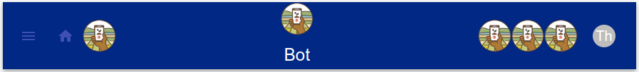
Hamburger Menu: If enabled through configuration, a hamburger menu icon is displayed on the left side of the toolbar. Clicking this icon toggles the sidebar open and closed.
Home Icon: If enabled through configuration, a home icon is displayed on the left side of the toolbar, alongside an optional additional icon specified in the configuration. Clicking the home icon typically navigates the user to the home page of the application.
Center Logos: If configured to display, logos specified in the configuration are rendered in the center of the toolbar. These logos can be any image files.
Brand Name: If specified in the configuration, the brand name is displayed in the center of the toolbar, below the center logos.
Right Logos: If configured to display, logos specified in the configuration are rendered on the right side of the toolbar.
Theme Picker: A component allowing the user to select different themes for the application is rendered on the right side of the toolbar.
Dependencies
- React: JavaScript library for building user interfaces.
- Material-UI (Mui): React components for faster and easier web development.
- ThemePicker Component: T A custom component for selecting different themes for the application.
Configuration
- All the configuration can be done from the config.json file for the navbar component. Here are some of the common configuration types:-
Hamburger:
Toggle the visibility of the hamburger menu icon by modifying the showHamburgerMenu property:
"showHamburgerMenu": true // or false
Brand Name:
You can put your brand name to get it reflected on the UI
"brandName": "Bot" // or any other name
Config Obj:
      "showNavbar": true,
      "showLanguageToggle": true,
      "languageCode_1": "en",
      "languageLabel1": "ENG",
      "languageLabel2": "ENG",
      "languageCode_2": "",
      "showHamburgerMenu": true,
      "showHomeIcon": true,
      "showCenterLogo": false,
      "centerLogoSrc": "",
      "showRightLogo1": false,
      "rightLogo1Src": "",
      "showRightLogo2": false,
      "rightLogo2Src": "",
      "showRightLogo3": false,
      "rightLogo3Src": "",
      "centerLogoSize": "60px",
      "logoTitleColor": "#1e6231",
      "newChatButtonColor": "#1e6231"
Notes
- This molecule is not properly routed for the project. Route it according to your project and customize the icons to your brand theme and work on it.