Message Item
The MessageItem component renders individual chat messages in a chat interface. It provides support for various types of messages such as text, images, files, videos, and options.
Usage
import MessageItem from './MessageItem';

const App = () => {
  return (
    <MessageItem message={messageData} config={configData} />
  );
}

export default App;
Description
The MessageItem component is a reusable React component designed to display messages within a chat interface. It accepts message data and configuration options as props, allowing developers to customize its behavior and appearance.
Functionality
- Text Messages: Renders text messages with sender information and timestamps.
- Images: Display images within the chat interface.
- Files: Allows users to view and download files shared in the chat.
- Videos: Supports embedding and playback of videos from platforms like YouTube.
- Options: Provides selectable options for users to choose from.
- Feedback: Enables users to provide feedback on messages.
- Text-to-Speech: Offers text-to-speech functionality for message content.
- Refresh Button: Allows users to refresh the chat interface.
- Styling: Customizable styles and themes to match the application's design.
Dependencies
@samagra-x/chatui: A chat UI component library for React.react-hot-toast: A library for displaying toast notifications.moment: A library for parsing, validating, manipulating, and formatting dates.
Props
message: The message object containing the content to be displayed.config: Configuration options for customizing the component's behavior and appearance.
Configuration
The MessageItem component offers flexibility for customization through its configuration options. Key configurations include:
- Bubble Styles:
Customize the appearance of message bubbles, including background color, border color, and shadow.
 <Bubble
  type="text"
  style={
    content?.data?.position === 'right'
      ? { background: config.theme.secondaryColor.value, boxShadow: '0 3px 8px rgba(0,0,0,.24)' }
      : { background: config.theme.primaryColor.value, boxShadow: '0 3px 8px rgba(0,0,0,.24)' }
  }>
- Button Styling :
Customize the appearance of buttons within messages, such as background color and border.
<button
onClick={() => window?.location?.reload()}
style={{
  border: `2px solid ${config.theme.secondaryColor.value}`,
}}>
Refresh
</button>
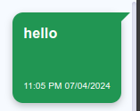
3. **Timestamp Display** :
Customize the appearance of message timestamps, including font size and color.

```tsx
<span
  style={{
    color: config.theme.primaryColor.value,
    fontSize: '10px',
  }}>
  {moment(
    content?.data?.sentTimestamp ||
      content?.data?.repliedTimestamp
  ).format('hh:mm A DD/MM/YYYY')}
</span>
Styling
The component utilizes CSS modules for styling, allowing for easy customization and integration with existing stylesheets. Theme colors and styles can be configured through the provided CSS classes and theme object.
Additional Actions
Users can perform additional actions like sharing or downloading the chat conversation through the icons provided on the UI.
Notes
For further customization and integration, developers can modify the JSX structure, styles, and functionality according to specific project requirements.