Downtime Page
The DowntimePage is a React component designed to inform users when website or online service is temporarily unavailable. The goal is to provide users with clear communication about the situation by keeping them informed.
Usage
import DowntimePage from './DowntimePage';

const App = () => {
  return <DowntimePage />;
};

export default App;
Description
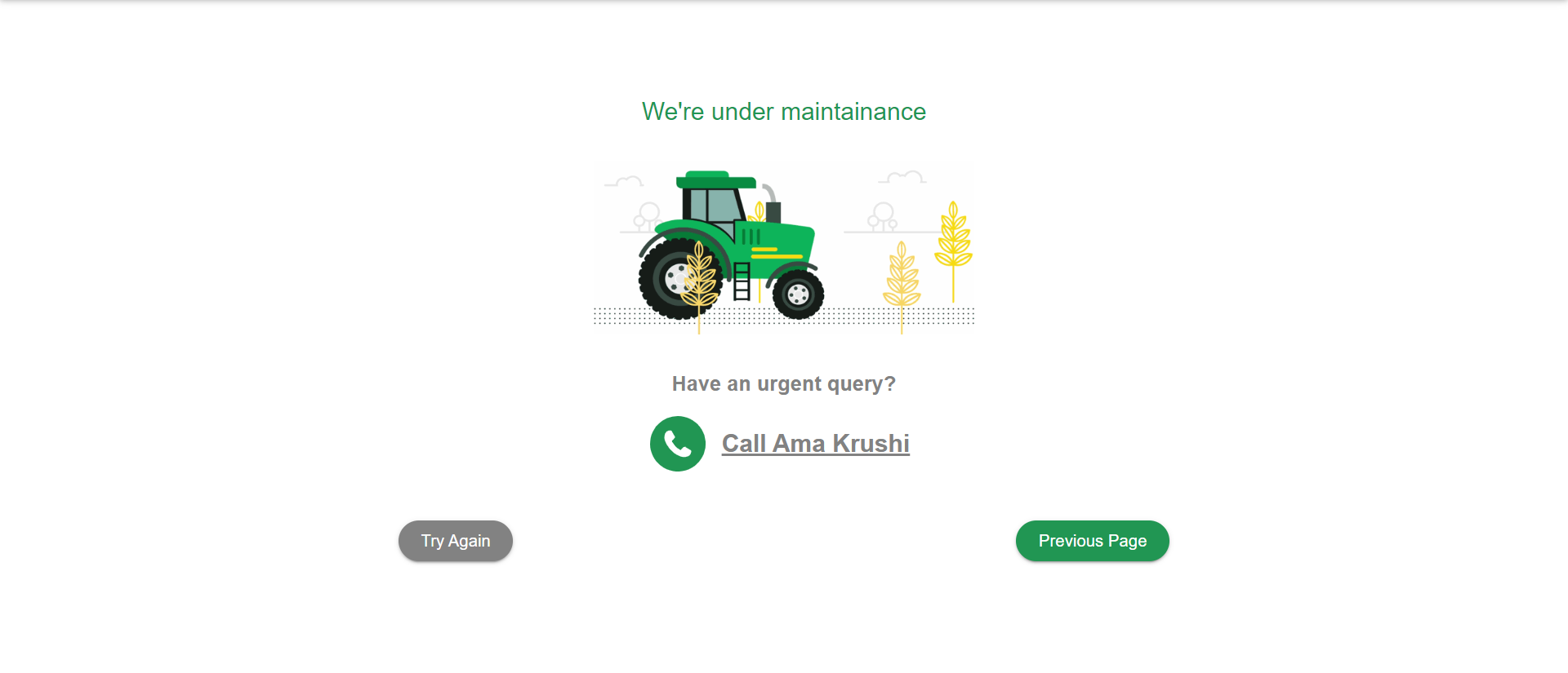
The DowntimePage consists of the following elements:
- Contact Us button to contact support during downtime.
- Try Again button to refresh the tab.
- Previous page button to go on previous page.
Functionality
- This Page will be displayed when the website is under maintainance.
- Users can refresh the page by using Try Again button.
- By clicking Contact Us button, user can contact the support team.
Dependencies
- React: JavaScript library for building user interfaces.
- Material-UI (Mui): React components for faster and easier web development.
Configuration
- The default theme colors can be configured in the config.json file.
- The component keys can be configured in the config.json file.
Styling
- CSS modules are used for styling the component.
- Styles are defined in the index.module.css file.
Customization
This Page provides flexibility for customization to suit your application's requirements. Here are some customization options:
Theme Customization
You can customize the theme colors by modifying the values in the config.json file. The theme object contains primaryColor and secondaryColor properties, allowing you to specify the colors according to your brand or design preferences.
"theme": {
  "primaryColor": {
    "value": "#219653",
     },
  "secondaryColor": {
    "value": "#828282",
     }
}
Adding Custom Actions
To add custom actions for contact us, refresh or previuos page button, follow below steps:
- Contact Functionality: Implement the contact support logic within the
handleContactUserClickfunction. You can use call or email options to connect with the required team.
const handleContactUserClick = useCallback(() => {
  console.log(component.contactLink ?? 'Contact Details'); //Implement your contact user logic here
}, []);
- Refresh Functionality: Implement the refresh logic within the
handleRefreshClickfunction. You can use reload() method to refresh the page.
const handleRefreshClick = useCallback(() => {
  // window?.location.reload()
  console.log(component.refreshText ?? 'Contact Details');
}, []);
- Previous Page Functionality: Implement the previous page logic within the
handlePreviousClickfunction. You can use back() method to go to the previous page.
const handlePreviousClick = useCallback(() => {
  // window?.history.back();
  console.log(component.previousPageText ?? 'Contact Details');
}, []);
Updating Component
You can update the component keys by modifying the key value in the config.json file.
"component": {
      "downTimeImage": "",
      "downtimeShowCallBox": false,
      "downtimePhoneNumber": ""
  }
Notes
- For further customization, you can modify the JSX structure, styles, and functionality according to your application's needs.