Feedback page
The FeedbackPage is a React component designed for user review and rating about the app. It provides a user-friendly interface for users to rate/review and submit.
Usage
import FeedbackPage from './FeedbackPage';

const App = () => {
    return (
        <FeedbackPage />
    );
}

export default App
Description
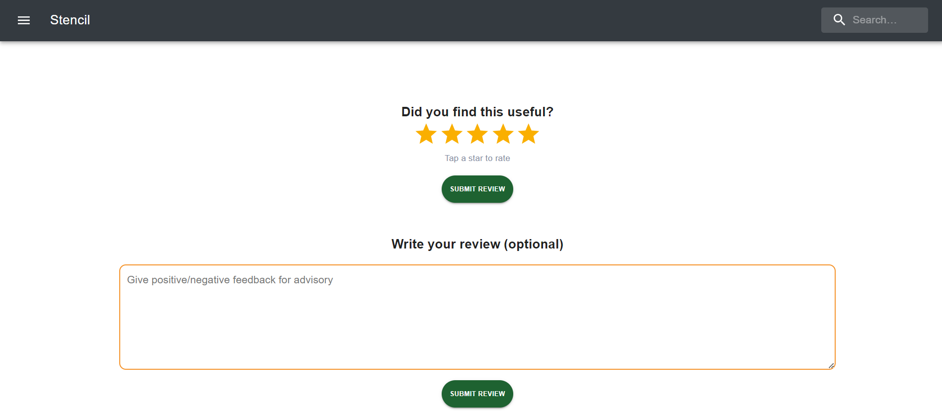
The FeedbackPage consists of the following elements:
- Star rating element to rate the website.
- Submit review button for sending the review of user.
- Review area to write review of website of user.
- Submit review button for sending the review of user.
State
star: Number state to store the number of stars rated by userreview: String state to store the input value i.e. reivew written by user
Functionality
- Users can select number of stars to rate website.
- The star field validates the number of stars selected and validates the number and display appropriate messages.
- Users can also write a review which is an optional field.
- Upon clicking the submit review button, the component checks if the input is valid and initiates the submission process.
- If the input is valid, a success message is displayed, and if not, an error message is displayed.
Dependencies
- React: JavaScript library for building user interfaces.
- Material-UI (Mui): React components for faster and easier web development.
- React Hot Toast: Toast notification library for React applications.
Configuration
- The default theme colors can be configured in the config.json file.
- The components can be configured in the config.json file.
Styling
- CSS modules are used for styling the component.
- Styles are defined in the index.module.css file.
Customization
This Page provides flexibility for customization to suit your application's requirements. Here are some customization options:
Theme Customization
You can customize the theme colors by modifying the values in the config.json file. The theme object contains primaryColor and secondaryColor properties, allowing you to specify the colors according to your brand or design preferences.
"theme": {
  "primaryColor": {
    "value": "#ffa500",
     },
  "secondaryColor": {
    "value": "#1E232C",
     }
}
Adding Custom Actions
To add custom actions such as registration or additional authentication steps:
- Review Submission Functionality: Implement the submission logic within the
handleFeedbackfunction. You can trigger a submission process with your backend service.
const handleFeedback = () => {
  // Implement your registration logic here
};
Updating Component
You can update the component keys by modifying the key value in the config.json file.
"component": {
  "ratingBox": true,
  "reviewBox": true,
  "ratingMaxStars": 5
}
Notes
- This Page does not handle actual submission of rate and review. It simulates the process by displaying a success message upon clicking the submit review button.
- For further customization, you can modify the JSX structure, styles, and functionality according to your application's needs.