Launch Page
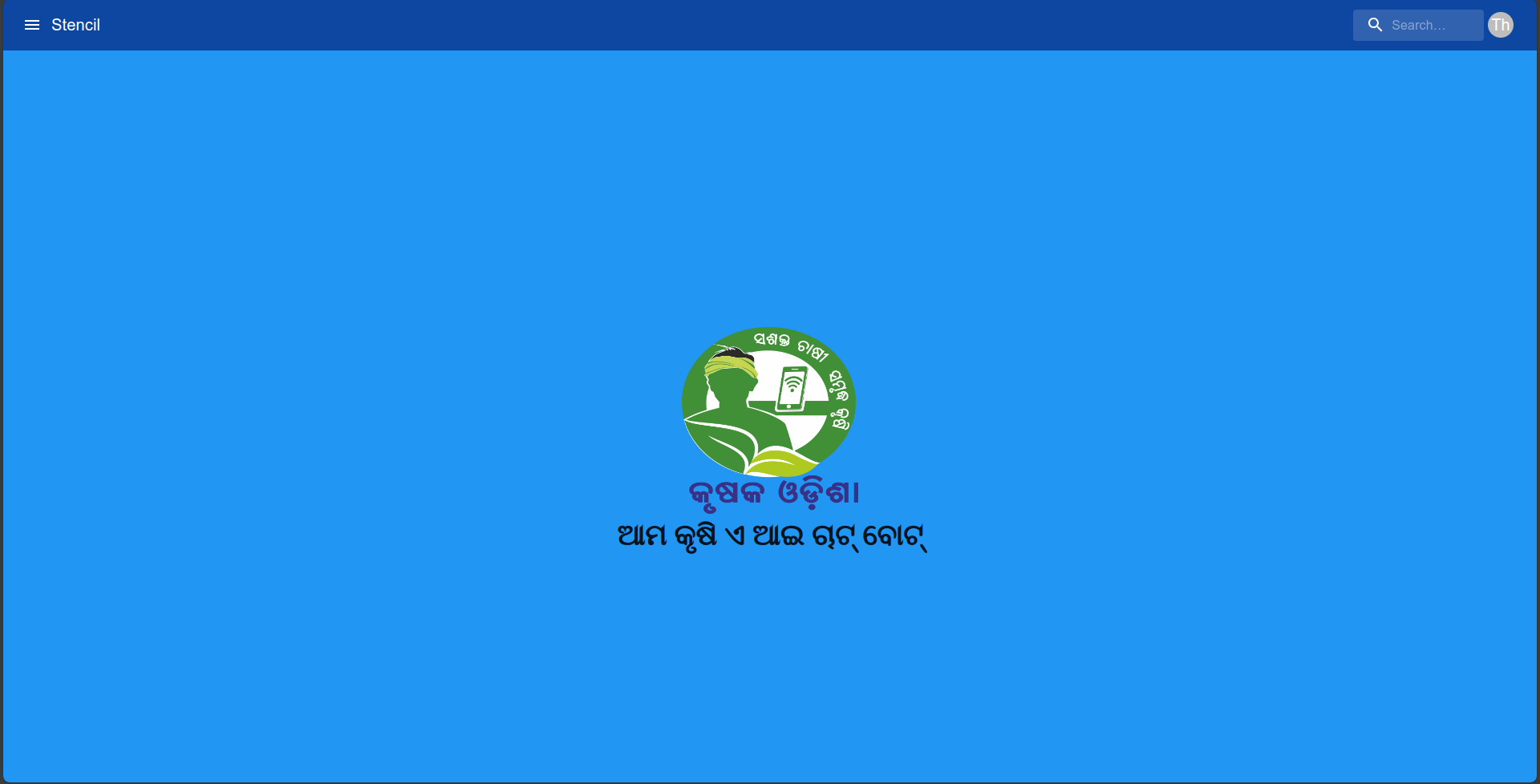
The LaunchPage component is a React page designed as the initial landing page for the application. It showcases branding elements such as a logo and a label.
Usage
import LaunchPage from './launchPage';

const App = () => {
  return <LaunchPage />;
};

export default App;
Description
The LaunchPage consists of the following elements:
-It displays a logo and a label representing the branding message of the application.
Functionality
- The LaunchPage component provides a static display of branding elements and does not offer interactive functionality by default.
Dependencies
- React: JavaScript library for building user interfaces.
- Material-UI (Mui): React components for faster and easier web development.
Styling
- CSS modules are utilized for styling the component.
- Styles are defined in the
index.module.cssfile.
Customization
The LaunchPage component offers flexibility for customization to match your application's requirements. Here are some customization options:
Theme Customization
Modify the colors and styles in the index.module.css file to match your application's design.
Component Configuration
Update the component object in the config.json file to customize the title and other configurations
"component": {
     "logo": "",
     "showLaunchPage": false,
     "launchPageColor": "#d2f4df"
 }
Notes
- For further customization, you can modify the JSX structure, styles, and functionality according to your application's needs.